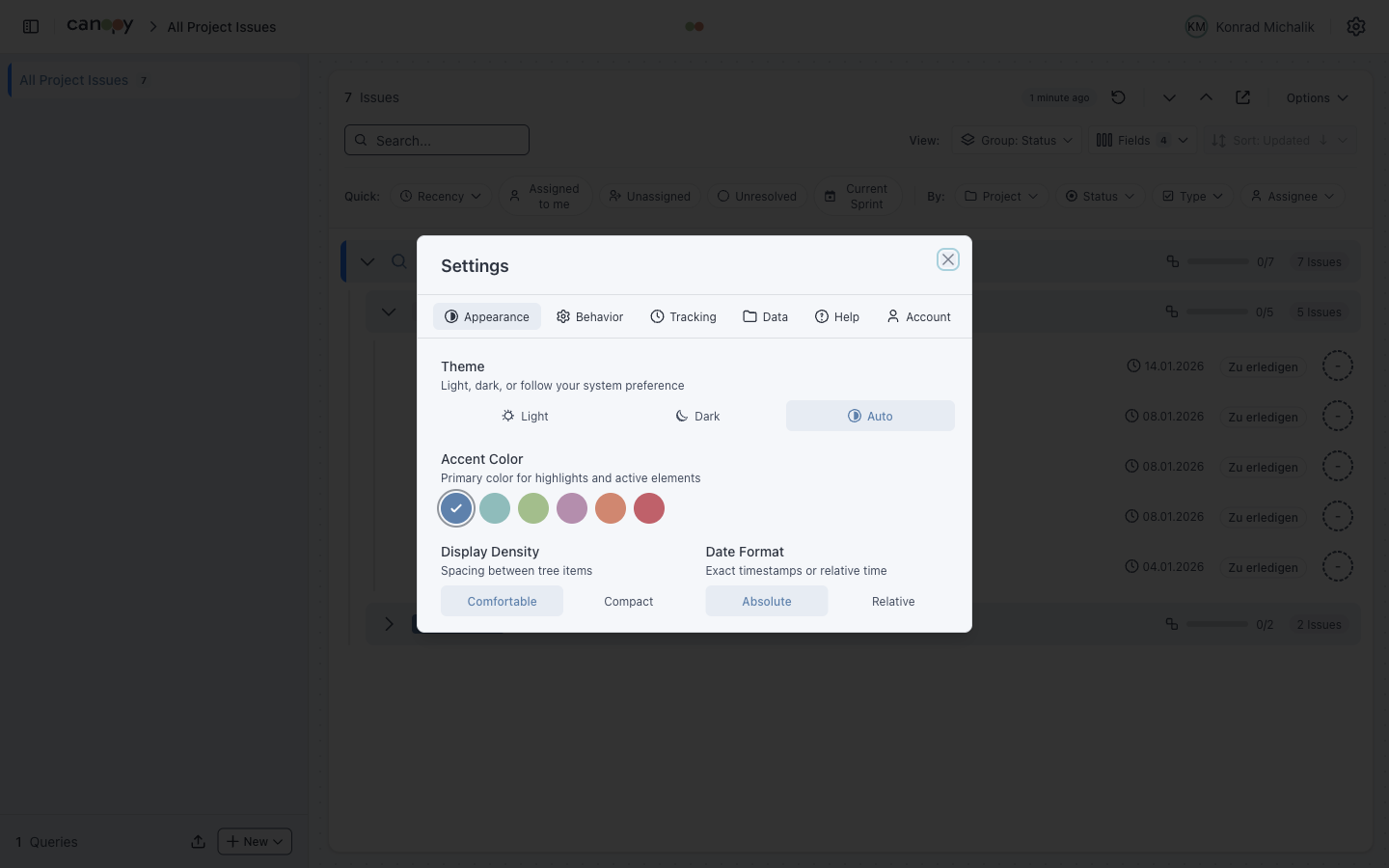
Theming
Customize Canopy's appearance to match your preferences.
Color Mode
| Mode | Description |
|---|---|
| Light | Light background, dark text |
| Dark | Dark background, light text |
| System | Follows OS preference |
Toggle via Settings > Appearance.
Accent Colors
Customize the app's accent color used for:
- Active states
- Links
- Progress bars
- Selected items
- Buttons
| Color | Description |
|---|---|
| Frost (default) | Cool blue-grey, professional |
| Ice | Light teal, calm |
| Aurora | Soft green, nature |
| Lavender | Gentle purple, creative |
| Sand | Warm orange, energetic |
| Rose | Bold pink, attention |
Atlaskit Integration
Canopy uses Atlassian Design System tokens for Jira-consistent theming:
- Status colors match Jira categories
- Priority icons use Jira styling
- Issue type icons are consistent with Jira
This ensures visual consistency when working between Canopy and Jira.
Settings Persistence
Theme settings are persisted to localStorage:
| Setting | Storage Key |
|---|---|
| Color Mode | canopy_theme |
| Accent Color | canopy_color_theme |
| Display Density | canopy_display_density |
| Date Format | canopy_date_format |
Settings sync across browser tabs and persist after closing.
Display Density
Adjust spacing between elements:
| Mode | Description |
|---|---|
| Comfortable | More whitespace, larger touch targets |
| Compact | Reduced spacing, more content visible |
Compact mode is useful for:
- Smaller screens
- Viewing large issue trees
- Quick scanning
Keyboard Shortcuts
No keyboard shortcuts for theming. Use the settings menu.
Exporting Theme Settings
Theme preferences are included in the configuration export:
- Click Settings > Data > Export Configuration
- The JSON file includes:
theme(light/dark/auto)colorTheme(frost/ice/aurora/lavender/sand/rose)displayDensity(comfortable/compact)dateFormat(absolute/relative)
Import this file on another device to restore your preferences.